 |
Abstract: This article describes in brief detail, why sharp edges are a problem with sculpted prims. I will first explain, what happens, then i will show you a method how to avoid the effect. Important Note: Please take a minute to read the Tutorial license terms. |
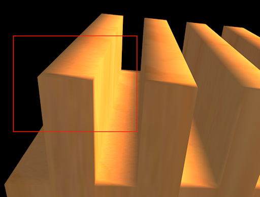
Let us take a look at a sculpted prim with sharp edges:

Look at the part enclosed with the red frame. Here you see, that although the sculptie has got very sharp 90 degree edges, the SL lighting system seems to distort the edges and makes the object look totally wrong. Let us zoom into the marked area of the image:
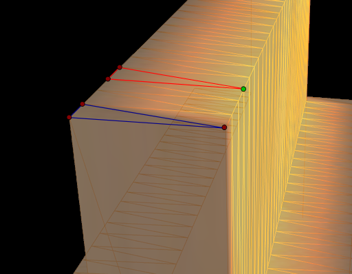
Now you can see how the sculptie is constructed out of a set of triangle surfaces. I have added the wireframe of the object and made it semi transparent, so that i can better explain, what exactly happens. Let us take an even closer look at the 2 triangles marked in the above picture:
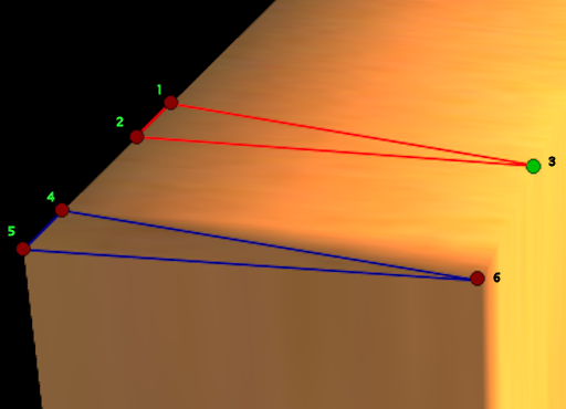
Let us first look at the triangle spanned over the 3 corners 1-2-3 and explain how lighting is calculated:
The vertex lighting algorythm first calculates the light intensity at each of the triangle corners. In simple terms it calculates the sum of the light energy coming from all light sources in the environment, but it only calculates the values for the triangle corners and thus saves a huge amount of processing time which would otherwise be needed to calculate the lighting for each surface point.
Once the light intensities are calculated for the corners , the process fills the whole triangle with an intensity-gradient where the calculated intensities at the corners are used as reference points. For instance look at the edge 1-2. There the light intensity is calculated to be low, hence the edge is rendered dark. At point 3 the object is lit up with the full sunlight, hence it is bright. So the gradient runs from dark to bright over the whole top side.
Now we could argue, that the corners 1 and 2 have been assigned to the wrong side. Apparently they should be associated to the top side and not to the back side! Hence we expect, that the edge should be equal bright as with corner 3.
But if you think a bit more about the algorythm behind the scenes, you will find an ambiguouety here: The edge 1-2 can be assigned to the top surface as well as to the back surface:
Let us assume for a moment, that the renderer had “correctly” assigned the edge 1-2 to the top surface. Then the corners 1 and 2 would be rendered in bright light, which happens to be the same light as associated to corner 3. Hence the whole top surface would be rendered correctly, namely in a bright shining color. But look here at the back side of the object:
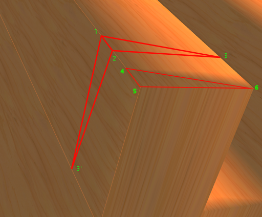
Now we have the opposite problem: edge 1-2 is not only used to make the 1-2-3 triangle, but also a secnd triangle on the dark side uses the same edge. But (as we have assumed by now) both corners (1 and 2) have been associated to high intensity values and the corresponding third corner on the dark side (lets name it 3′) will clearly be associated with “low intensity” since it lays in the shadow. So the renderer now must render a gradient from light to dark, thus bleeding the sunlight right into the backside and again we had a wrong lighting.
In a short summary: The renderer has no chance to render the dark side and the top side correctly at the same time, so it has taken its choice and decided to draw the dark side correctly and mess up the top side in our case.
THis is not a bug, but a consequence of the lighting claculation, which works almost perfectly for smooth surfaces, but not at all for sharp edged surfaces.
Now look at the even worse triangle 4-5-6: Here all three corners are assigned to low intensity, hence the whole triangle is rendered dark although its surface is 100 % laying on the top side. The exact same argumentation holds here: whichever light intensity we asssign to one of the triangle corners, we always end up with one side displayed correctly, the adjacent side displayed totally wrong.
So what can we do in order to get away with this effect ? We have basically 2 options. The first option is very straight forward and effectively disables vertex lighting: We simply make the sculpty full bright and apply an appropriate texture on it, which contains the needed shadows (or we just forget about shadows):
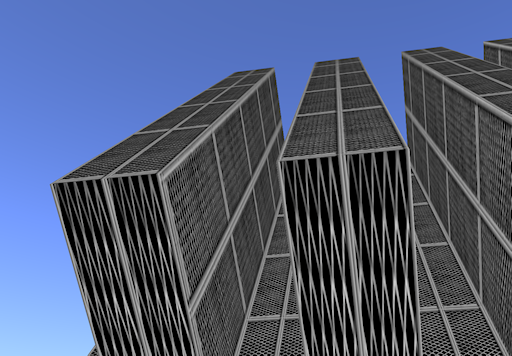
The other possible solution is to stop the light intensity to “bleed” into the wrong surface. This is done in principle by resolving the ambiguouety mentioned above by adding an additional line of vertices at each sharp edge.
The following picture shows a construction model made in blender:
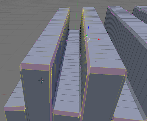
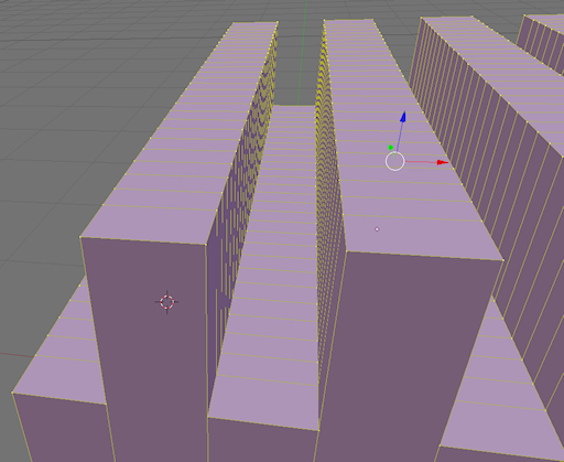
I have hit the smooth button once, so that you can see, how each double edge is made out of 2 vertex loops. In the final model i have collapsed all double edges so that the result again contains a sharp edged sculpted prim:
And after importing the sculptie to SL, now the intensity bleeding has effectively stopped:
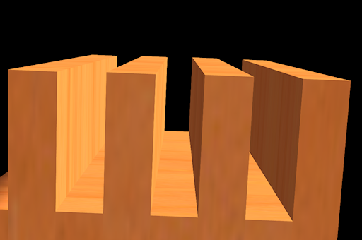
And why did the bleeding stop ? I am not 100% sure, but i guess that the renderer can clearly separate the 2 edge lines and assign one of them to the backside and the other one to the top side respectively…
With other words, any triangle laying in an ambiguous area (where one edge could be assigned to 2 faces with differenig light intensity) has been collapsed to zero size, hence it will not be rendered and as a consequence we see sharp edges again.
Conclusions
- If you need full control of the objects lighting behaviour, use the “duplicate lines” technique as described above. But be aware of the fact, that you may get very odd behaviour regarding LOD. Be prepared to see texture jumping and if you dont take special care, you will also see LOD jumping at its worst.
- If you can live with static shadows on the texture, make your object fullbright and create the appropriate texture.
- If you want to texturize, but do not want fullbright, you must live with the bleeding effect, which still occurs, but it can be partially hidden by using your own shadowing on the texture. This can be artistically interesting but it does not make up for a “realistic” light/shadows effect.
- At the end i can see, that you even could start playing with the bleeding effect itself and let it work for you instead of against you…
And of course you could use all techniques at the same time on the same sculptie at different regions. At the end it depends on the effect that you want to achieve which technique you will use. But i guess that it is good to know about the alternatives!
So dear reader… Please consider these conclusions as possibilities, not as advices!!!
And have Fun
Gaia